Monday, December 31, 2012

Top 12 from 2012


I'm excited for the start of another year but can't help but feel a little sad about another year coming to a close. Another year older, another year wiser (maybe!). Before celebrating the new year I wanted to spend some time reflecting on this past year and all that has happened. As far as my "design life" goes, it's been a crazy year full of of challenges, excitement and also heart break (more on that later).

So here goes, my Top 12 posts from 2012 (click on the number to view the post):

#12: Katie Ridder has got to be in my Top 12 posts because she provides a great source of inspiration for me. I can't tell you how many times I've looked back at this post just to check out the lovely images from time to time.


#11: My dream home going on the market......and being under contract less than a week later. I still walk or drive past this home all the time (it's in my neighborhood!) so if it ever goes up for sale again, I'll at least have a chance to go through it! As an update, the new owners have done some remodeling since I saw a Cambria sign in their front yard. wonder what they've done...?


#10: I participated in EcoRehabarama, a joined effort to promote home-ownership and revitalize parts of Dayton. This years event took place in Huber Heights, a suburb about 10 minutes north of downtown. It felt good doing something to help the community!


 #9: I won the People's Choice Award for best design for the third year in a row at the Dayton Home and Garden Show. I created a vintage movie theater to go with the theme "Let Us Entertain You." As always, it was a lot of fun and great free advertisement for my company.


 #8: I moved into my first studio/office near downtown in the Oregon District. It was an exciting moment for me, as well as a big leap of faith for my business. In the end it didn't work out (long story short, I was subleasing the space and the guy I paid rent to wasn't paying HIS rent so we ended up getting kicked out). It was a learning experience to say the least. Even though it ended badly, I can't say I regret it.


 #7: So after I was "kicked out" (gees, I feel like such a rebel! haha) I moved my office space into my home, which was also new for me since before I didn't really have an organized place where I worked. I really enjoyed working from home and was able to get a lot of work done. This room with all the windows is one of my favorites in my home, and the back windows overlook my herb garden in the backyard.


#6: I decorated this front porch for Tipp City's 2012 Christmas Homes Tour. It was the perfect project; short, easy to execute and easy to work with clients :)


 #5: I'm participating in the 2013 Dayton Showhouse and got my room assignment. While I'm sure the After photos will be more exciting, the before photos are so off-the-wall that I can't help but share....again!


 #4: Our wedding was featured in The Knot magazine! This past September also marks our one year anniversary and we couldn't be happier. Marriage is different from how I pictured it being but honestly, it's better than I could have imagined! I can't think of anything better than spending everyday with my best friend.


#3: Of course I couldn't forget my "finished" client projects. There are SO many more projects I've worked on this past year but looking back I realize I am terrible at finding that stopping point where I can say "it's finished. Let's photograph it." That just does not seem to happen very often for me! Here at least are some bathroom projects that did manage to get "finished!"

Guest Bathroom:


Bathroom for Her:


Bathroom for Him:


 #2: Brian and I (along with a TON of help from my brother John) finished remodeling the first of several rooms in the basement. This room will serve as the inspiration to finish up the rest of the basement (hoping to make a huge dent in the remodeling for 2013!!) I can tell you that NOTHING makes me happier than working on my own home and getting to live with the results. It was an amazing feeling watching the worst room in my house transform into something lovely and usable!


#1: I'm choosing my unfinished dining room as my Number 1 because it has been the bain of my existence since moving into my house 2 years ago (can't believe it's been 2 years!!). I've made a lot of changes during the past two years but nothing felt right. Yes, I did paint the walls emerald green but ended up hating it so I recently painted them again. I will post some "after" photos soon since I'm finally happy with the way it turned out!


Looking back I realize how hard I've worked but I feel as if I don't have a lot to show for it. I know I am very hard on myself, I'm definitely my worst critic! So without getting to depressing before the new year, I will save my BIG news for next year. Have a wonderful evening of celebrations and cheers!!

~Laura


Monday, December 17, 2012

Client Project: New Master Bathroom in the works!

This client came to me wanting to remodel his Master bathroom. His large tub is his favorite place to relax at the end of the day so we wanted to further push that feeling of relaxation. He suggested wanting it to feel as if he were on the beach and I thought that was the perfect place to start!

We stuck with a fairly neutral color palette with a lot of warm tans and some splashes of blue carried throughout the tile. The cabinetry and countertops, sinks, and shower all echo the earthy, beach feel. I really can't wait to see it all come together! 

I've been planning this bathroom project for a couple of months now and I'm excited to say the demo finally started this past week! Before the project gets too far along remodeling-wise, I want to share some of the before photos:


Some of the features the bathroom already has going for it is lots of space, dynamic ceilings, large windows for natural light, & plenty of storage. That pretty much covers the basics of any dream bathroom. 


Now it's simply a matter of giving this baby a facelift and bringing it up to date! Lot's of beautiful stone tile, contemporary fixtures, amazing cabinetry, awesome lighting, and stunning details will do just that.


Since the current layout of the bathroom is functional and space isn't an issue, the layout is staying exactly the same. Other than that, pretty much everything is going!


I stopped in the other day to meet the contractors and go over the plans, questions, etc. and this is what is looked like after only one day of demolition:

Goodbye bathtub!


Goodbye looooooong vanity!


And goodbye shower.

 Pretty big changes just for on day, huh?

I'll keep you updated as I check in. I'm excited to see the progress! Stay tuned tomorrow - I'm going to be sharing a mood board for this project to give an idea of the materials. It's going to be stunning!


Wednesday, December 12, 2012

Client Project: Bathroom #2 revealed!


To continue from yesterday's post where we took a look at the first bathroom,  Here is bathroom #2 (highlighted in green below).
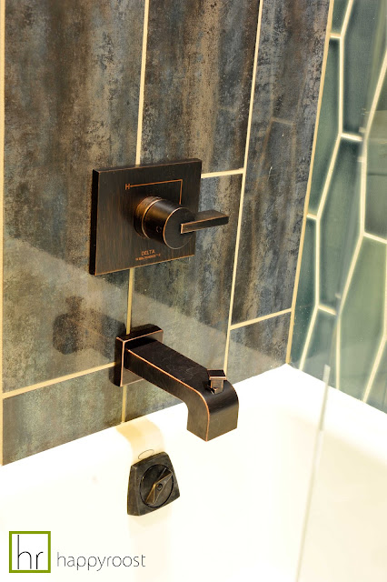
 This bathroom, like the first one, was a blast to work on. It was designed for an 8 year old boy so I wanted it to feel more masculine than the first, but also something that would stand the test of time. Obviously he's not going to be 8 forever! It needed to be fun for an 8 year old but cool enough for a teenager, and classic enough for anyone buying the home later on down the road since this is a temporary stay for the owners.


I started with the tile. The blue geometric tile is by Pratt & Larson (I'm using something similar in another project coming up!) From there I found the mirror. I like how the shapes play off each other. I also knew the fixtures would be oil rubbed bronze to tie into the rest of the fixtures throughout the house and I liked how the mirror brought it some lighter gold tones to contrast the bronze.

The floating cabinetry, square sink and frame-less glass doors keep it contemporary.


Well, that's a wrap on this project. I hope you enjoyed seeing the end result! Project reveals always make the project seem so quick and easy but trust me, there is a lot of work and time involved to make it happen! Bathroom remodeling projects can be complicated, even for a relatively small bathroom like this one. There are a million decisions to make, orders to place, deliveries to check, potential installation problems and general goof-ups along the way. Hiring a designer helps the entire process go more smoothly. The end result is a 100% custom bathroom designed specifically for YOU. Unique fixtures and finishes will make your new space anything but ordinary.

If you're thinking about remodeling soon and you live in the Greater Dayton area, get in touch with me! You'll be glad you did! laura@happyroost.com

Stay tuned next week for another bathroom project in the works. When finished, it's gonna knock your socks off :)


Tuesday, December 11, 2012

Client Project: Bathroom #1 Revealed!


Yesterday I discussed the plans for this bathroom (you can read more about it here) and today I'm sharing the finished photos of one the baths (highlighted in green). This bathroom was designed for a 13 year old girl with pretty sophisticated tastes :)  She wanted her bathroom to feel very spa-like and wanted to incorporate lime green into the color palette.
 
 Once again, here's a before shot of the shower:            And the After:


Since this was for a teenage girl, I thought it would be fun to add a small vanity/make-up area.


The frameless glass enclosure allows the small bathroom to feel larger while showing off the pretty tile inside.
One of my favorite ideas for this bathroom was to wrap the tile onto the wall all the way across the wall - not just in the shower area. I further accented the vertical lines by adding an accent stripe down the center of the shower.


Tomorrow I'll share some more showing the other bathroom for an 8 year old boy.

Special thanks to Kathryn of "Pix by Kathryn" for the amazing photos!

Have a great day!

 ~Laura


**If you're thinking about remodeling a kitchen or bathroom in the near future, send me an email at laura@happyroost.com  I'd love to hear from you!**

Monday, December 10, 2012

Client Project: Transforming 1 Bathroom into 2

 This project was done for a family who moved to Dayton from out of state. Before they had even purchased the property, I was allowed into the home to take some photos and measurements in order to get started working on a bathroom layout. It was nerve wracking having only gone into the home once before the final plan was drafted!

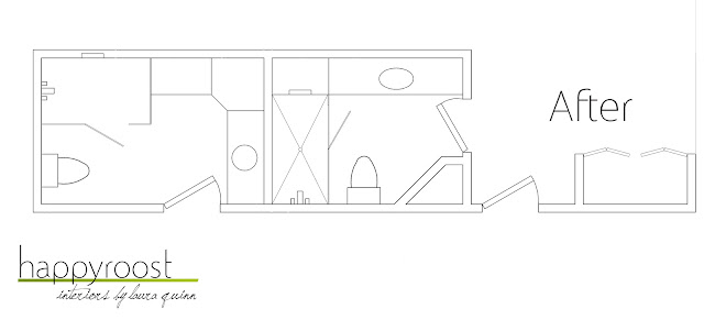
The original bathroom was sort of a jack and jill bath except it had a lot of wasted space. There was so much wasted space in fact, I was able to turn it into two separate bathrooms for each of their children. Granted, they lost quite a bit of storage but luckily, a lack of storage was never an issue.

Here's the  before plan full of too many doors and awkward angles:


And here is the plan I came up with:

Later this week I'll be revealing the finished photos (Can't wait to show you!!), but for now, this is what it looked like before:


At 8'-6", this is definitely the longest vanity I've ever seen that wasn't in a public restroom!


Stay tuned for more later on!

~Laura