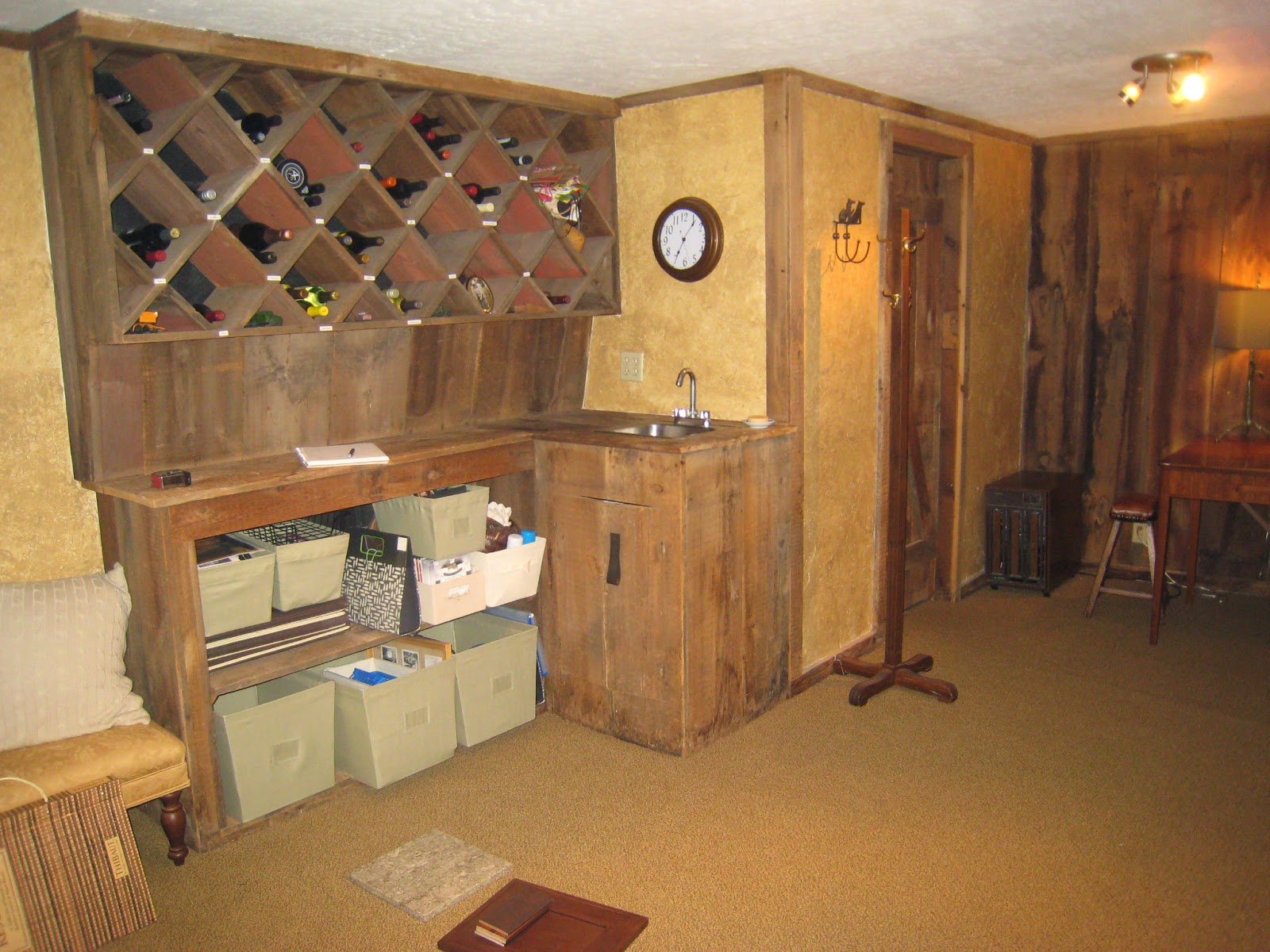
Here are the "before" shots.....
You can see it feels very dark, and while cozy, it just needed some freshening up!
I kept the wine cabinet above and made it the focal point of the new bar design. The bar was moved to the wall on the right, and the bar wall became the tv wall. Behind the barn door is a powder room.
And because I can't wait to show you any longer, here is the After!
The wine cabinet now looks so much richer now surrounded by gorgeous custom cabinetry and barn wood trim. It takes on a very tailored, sophisticated vibe. I was lucky to find cabinetry that perfectly matched the wood tones of the barn wood. The sconces at the top also turned out great!
I am completely in love with this backsplash! The geometric pattern from the tile is repeated throughout the space in the cabinetry hardware, carpet, and textiles.

Bathroom door before and after: Again, I wanted to keep much of the barn wood character intact, without things getting too cowboy-ish. The grasscloth paper and custom chair railing really polish off the room. It's the little details like this that I love working into my projects!
Another thing that makes this room so special is that it's filled with my clients' personal memories. The postcards to the left of the door were collected over various trips to state parks. I had them framed together to add a powerful punch of color.
Most of the furniture came from either Arhaus or Restoration Hardware. Some items, like the card table and the map above, already belonged to the client. I love working my client's existing belongings into a new space. Rooms feel more natural with multiple layers of years and styles. Aged, like a good wine. The saying is true: never buy all your furniture at the same place, or in a matching set.
These chairs really do perfectly complement the table.
All of the items in the gallery wall also belonged to the client. Some the items we re-framed and I added the shelves to visually collect the smaller items. The family photos, antique pocket watches and school memorabilia will make great conversation pieces while entertaining.
In order to make sure all the pieces fit together, I had my client gather all the items she wanted to include. I then numbered and measured each piece. I measured the wall, the placement of windows and light switches and plugged it all into CAD. I then played around with it until I had the layout just right (I tend to geek out on stuff like this!). I filled the gaps in here and there with new frames filled with the owner's incredible photography.
(O.k., seriously, how cool is this carpet?!)
Well, that's a wrap. I hope you'll keep me in mind for a future project you may be thinking about (or not thinking about!). Although I'm currently working full-time (and working on my MBA!), I am still taking on new clients for the spring of 2015. If you're willing to be patient with my crazy schedule, I promise the end result will be well worth it. Thanks for taking the time to check out another project of mine - I will have more to share soon.
And as always, THANK YOU to my father, Tim Weimer and brother, John Weimer, for turning my sketches, scribbles and wild hand gestures into physical reality. Their craftsmanship and attention to detail is bar-none on all the projects we tackle. Together, I think we make a pretty fab team.
Thank you also to my husband Brian for putting up with my insanity from time to time. Oh, and for taking the awesome pics. I love that we can share this stuff together.
xoxo,
Laura


