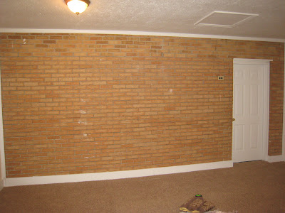
Here's a "before" shot again of the general room after entering the front door:

And here's the after:

The bed is the leather Jameson bed from Pottery Barn. The beautiful Asian inspired armoire can be ordered online here.

This sofa is a sleeper sofa for guests and turns into a queen size bed. The sofa is by Cassius and can be found here.

This carved wooden wall hanging already belonged to the client that he got from Thailand. It fits perfectly over the sofa.....isn't it gorgeous?!
Here's a "before" shot again of the entry and the soon to be kitchen/dining spaces:

And here's the after:


The bar and stools is compact and fits the overall zen feel the client wanted. The table can fold in half and the barstools tuck neatly underneath.
Before:

And After:

One of the space planning challenges was that the client wanted a full size fridge and stove in the "kitchen." As a compromise I selected a counter-depth fridge to save a little space. Another challenge was where to put the tv since the client wanted it viewable from the sofa, the bed, and the eating area. Since the wall above the countertop didn't serve any storage space, the tv works out perfectly here! All the wires are hidden neatly in a hole drilled through the brick wall. The teak floors really add to the clean, contemporary look and compliment the cabinetry nicely.
And look at this amazing granite!!

And lastly, the biggest challenge in creating this apartment was the bathroom. The bathroom did not exist before so we built it out into the garage since the garage was extra deep anyway.
Here it is!

Here's a picture of the general layout:

Be sure to check out my website later today for more pictures from this project!


Wow..love it. One question..the door in the kitchen area..does it go anywhere? Looks like the fridge blocks it from the pics, but just may be the angle. Just wondering.
ReplyDeleteThe door near the fridge goes to the bathroom. The fridge does not block the door at all - there's actually plenty of space but I agree - the photo does make it look that way!
ReplyDeleteYou made a challenging space work. Awesome job laura
ReplyDeleteI was just looking over interior designs on the internet and I just happen to stumble over this and realized..Its actually my apartment! She did amazing work and I still live comfortably in it since it was built. I only use it a few time a month while traveling to dayton for work but its fits and is perfect for my needs. Since then Ive actually installed a glass/brushed nickle shower door which seemed to add more depth to a small bathroom. I get tons of compliments. Thanks!!
ReplyDelete